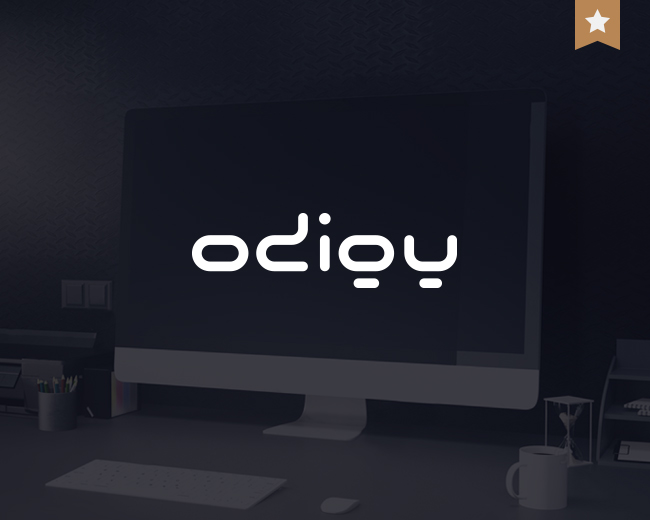
ODIGY Studio
by mucho • Uploaded: May. 02 '08 - Gallerized: May. '08

Float
(Floaters:
13 )
Description:
ODIGY is a small, but creative studio, founded by me.
As seen on:
website
Status:
Client work
Viewed:
8,011
Share:


Lets Discuss
Really interesting and very nice. Love how, although abstract, it's still very readable. Great work!
Reply10x jayred,**this is one of my favorites, even after so many years i still love it :) ... about readability i have to confess that some of my clients didn't read it immediately, but i have no problem with this - however it is designer's logo, not logo of milk or popcorn %3B)
ReplyThis is awesome. I had no trouble reading it at all. **I haven't actually checked, but appears that the descender portion of the %22g%22 is moved slightly right-of-center... I completely agree with this, yet can't help but wonder if it would help readability even more if it was pushed over just a little further.**Great work!
Replysharp eye mattpuchlerz %3B) it was a just a liiiiitle bit (subpixel :) ) ... anti-aliasing, you know :) ... now it is ok a hope - 10x
Reply%3C3%0D*%0D*perfect%0D*%0D*except the %22g%22 is still slightly closer to the i. It looks like the y is the problem with too much kerning.
ReplyI enjoyed looking through the identity work on your website. Congratulations on the feature, mucho.
Replyexactly what firebrand said... really enjoyed your website!
ReplyWhat font have you used? where to get this font??? :)
Replynowhere :) ... it is 100%25 handmade from scratch %3B)
ReplyPlease login/signup to make a comment, registration is easy