Kageboden
by minusfront • Uploaded: Jul. 14 '08 - Gallerized: Jul. '08

Description:
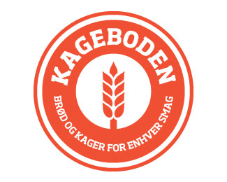
Mark for a bakery in Denmark. Warm, earthy tones to match the subject and the client-requested wheat stalk contained in a roundel.
*Edit* Image updated to show new, bolder monochrome direction as well as changes to typography and opening up of the wheat symbol.
Status:
Nothing set
Viewed:
6104
Share:


Lets Discuss
Solid mark
ReplyYeah really solid mark considering someone else already figured it out before you decided to rip it off and post it as your own well conceived design.**http://artbackwash.blogspot.com/2008/06/finishing-strong.html**BTW, I've already notified the ones whose equity you're clearly spinning off of.
Replyvonster you're being a bit harsh no? Have you contacted minusfront (Dean) first before accusing him in a cynical, bitter post?
ReplyI don't think we can actually know who conceived type on a circle. But I'm betting it first appeared on a coin a long, long, long time ago. Ease up there vonster. Draw the parallel but pull back on the knife just a tad.
Replyso that mean Target, Starbucks, Barack Obama, The Boston Red Sox and so many other brands are in trouble......
ReplyWow – I didn't think this would generate ANY controversy! If anything I thought it was a bit bland and generic...**I have contacted Vonster personally to explain how the logo arrived at it's current incarnation and clear up any confusion as to copyright dramas.
ReplyGreat update!
ReplyYea, I agree, great update. And minusfront, you have nothing to worry about with that other logo. This one stands on it's own.
ReplyVonster - Put the mouse down and slowly back away from the computer...**As gthobbs said, type on a circle isn't really that unique of a concept. I think the logo-police will let him go without so much as a warning on this one.
Replyyeah nice update!
Reply%22If anything I thought it was a bit bland and generic.%22**It is...but...in a good way, as odd as that sounds. It has a hip '80s-slash-European' vibe to it. I think the orange seals it as not being dated, but 'modern nostalgic'. Not sure if that makes sense, but that's the best I can explain. Bottom line, nice!**Also, WTF Von?
ReplyVonster, this is NOT a rip off! Come on...
ReplyOK, to be fair to Von, this appears to be an updated version. So perhaps the original was a tad too close to something else. Hard to say without seeing the original, though.
Reply%5Bquote%5DIt is...but...in a good way, as odd as that sounds. It has a hip '80s-slash-European' vibe to it. I think the orange seals it as not being dated, but 'modern nostalgic'. Not sure if that makes sense, but that's the best I can explain. Bottom line, nice!%5B/quote%5D**It's weird that it sounds odd because you are totally right. I also got a Dutch/Amsterdam retro vibe from this logo because of the Orange.**Well done minusfront!
ReplyLate posters to this thread %22Assume%22 the logo that is now showing in this post is the SAME logo that was originally posted. It is not. I suppose I should have taken a screen shot or pulled a copy of it off the site but I didn't.**So all of you who are %22Shocked%22 or think I was a bit harsh are just late to the game.**Just so you all know as well, I wasn't the one who called this out. I was emailed by other designers who felt it was clearly borrowed equity. The originating design firm who I did the iconography for felt the same way. So contrary to what %22Relevant%22 has said the concern was relevant.**If indeed the creator thought the mark was just a mere happenstance with no nefarious intentions I find it at least a little bit odd that he would then contradict that conviction and post an edited and revised version now?**Anyway that's the full scoop.
ReplyI invented the circle but not the square.
ReplyI actually thought this was a beer label. I feel it!
ReplyPlease login/signup to make a comment, registration is easy